If you’re writing SF or Fantasy, sometimes a map becomes a very important part of your story. I’ve been doing my own, but there are much better map artists out there. Found this one today:
Dewi Hargreaves, Map Art Commissions


If you’re writing SF or Fantasy, sometimes a map becomes a very important part of your story. I’ve been doing my own, but there are much better map artists out there. Found this one today:
Dewi Hargreaves, Map Art Commissions
I came up with an idea for the paperback/hardcover wraparound cover for Castle Falcon that includes the best part of my old cover.
The AI generator basically does a square output, and while I can “extend” simple items (like the cloudy sky), creating a whole wraparound of the Castle exterior image would have lost me a lot of resolution, so this was a good backoff position.

Castle Falcon was the first book I self-published years ago. At the time, I couldn’t afford cover art from professionals, and generated a cover using the only tools I had: the AutoCAD/AccuRender engineering combination I used to make realistic images of spacecraft in orbit.
I came up with a concept illustrating some of the major features of the book, and either purchased, created, or kludged 3D models of things like a dragon, a myrmidon, a wall, and a stained-glass window. It took a long time, and a lot of post work with Photoshop, but the cover came out okay. This was the wraparound cover I used for a dust jacket hardcover version: I still dreamed of having a pro do a nicer cover. I had imagined one layout showing the main characters Katie and Zach exploring the outdoor grounds of their huge castle home. Katie would be running down an ancient set of stairs, while Zach would be running his skateboard down the wide stone rail. In the background would be the countless esoteric and ancient structures of Castle Falcon, and in the distant haze the Black Tower would rise above all the lower buildings with the Dragon perched atop it. It would be perfect if Michael Whelan did it. Ah, well. Like most pro artists I’d ever approached, I never heard back from him. Hey, I at least wanted to know exactly what I couldn’t afford, right?
And then came AI imaging. I described how I redid my cover for Zorya, which turned out surprisingly good for surprisingly little effort. Could my dream cover be realized the same way?
I made a few attempts at a long and complex prompt that would spit the final image out, and as you might expect, got hash in return. One element might be good, but the others weren’t. After a while, I realized I’d never get what I wanted that way. So I decided to construct the elements separately, and Photoshop them together.
Start with the background. I created this prompt:
Ground view of large area of old buildings of many historical styles. Ivy grows on some. Grass surrounds them. In the distance, a single tall black tower rises. In the foreground is an ancient set of stone steps with railings.
You will note that I did not say “in the style of Michael Whelan.” I avoided this since it seemed to me it would be an engraved invitation to encourage the program to harvest his work. I later learned that the AI would have specifically rejected it anyway, but it seemed a good precaution.
It took only a few generations to give me this:

This was amazingly close to what I had in mind, although in my imagination the stairs ran from upper left to lower right. I could work with this. The Black Tower was all wrong. It was supposed to be a thin tapering spire with a chamber at the top. I wasted a lot of time trying to get the image to change that, or add the two kids, just to see if I could do it, but no dice. I just used normal image editing to “delete” the tower, and went on from there. I opened a Photoshop .psd file and went to work.
Start with Katie. The prompt: Girl running down steps, 12 years old, blonde, t-shirt, jeans shorts, and tennis shoes.
Again, it took only a few attempts to get a workable shot. Several versions insisted on having her run up the stairs.

I flipped it horizontally so she’d be running the right direction, and went on to Zach. The prompt: Distant shot, 11 year old blonde boy, dressed in t-shirt and shorts, with bare feet, riding a skateboard down a ramp. Hair is cut short and spiky.
Most of the attempts had him going the wrong way entirely, like moving away from me. But this one was perfect.

I used up some time trying to describe the Black Tower effectively in a prompt. I won’t list the prompts since I didn’t use them anyway. I wasted even more time in a dead end trying to get a tower with a dragon on it. What I finally did was dive into my Solidworks program and just model and render the very simple Tower design:

There we go. Finally, I needed to perch a separate dragon on top of the tower, so I had to generate a dragon. That took more time than any other element. AI has trouble with dragons. Here’s an early Dall-E attempt with an older prompt. The program had the same trouble with dragon wings as it did with hands. I switched back to Design and kept going.
 The final prompt: winged dragon, gunmetal color, perched on a steeple clear sunny sky. I figured I could just delete the steeple if I got the right pose. There were many dragons, some of them fairly decent, but this one had the look I wanted:
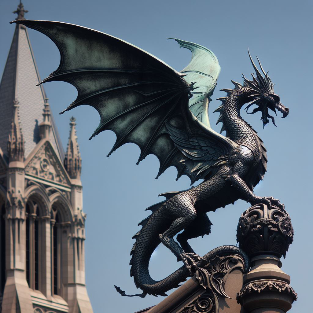
Clipped it out from the background, flipped it horizontally, and then went to work in Photoshop. I whipped up layers and pasted in the kids, the tower, and the dragon. Then came the tedious process of making them look like they weren’t pasted in. Borders needed a bit of blur to match backgrounds. Shadows had to be created for the kids, and some goofy AI stuff like the railings in the foreground of the background shot had to be tweaked. Katie’s proportions needed a little work. I had to put a hint of electric blue in the children’s eyes. The tower and dragon had to have some distance put on them. And then I had to use an AI image extender to increase the height of the entire image so there’d be plenty of room for a title if I used it for a cover.
This was the end product:

Detail of the kids:
I haven’t done anything to make a final book cover out of this yet. We’ll see what happens. I notice that there’s a lot of “matte painting” style to large AI landscapes. Detail suggests itself to the eye even if it tends to break down under magnification. You see what you expect to see. A real painting examined very closely does this too.
I’ve never been really happy with the old “IPod” cover for my book Zorya. The iPod ad reference was clever at first, but is probably highly dated now. The punch line of the teeth was largely invisible at the smaller scales in ads and book previews.

My vision was a realistic image of Zorya on her hunting trip in the forest, gazing with wonder at the deep sky visible to her eyes. A while ago I attempted a Photoshop patchup starting with a stock image (expensive):
After a lot of cutting, pasting, massaging, and fusing my daughter’s face into it, I ended up with this:
Nobody was happy with it. The model wasn’t right physically, the lighting was a mess, it was an obvious pasteup, and my daughter didn’t really like me using her face. I released Zorya using the iPod cover, and shelved my “Zorya in the woods” image.
* * *
Then recently, with the new Artificial Intelligence (AI) image creators, I decided to try my hand at a new cover. Why not? Apparently all it would cost me was some time. I pulled my “Zorya in the woods” concept off the shelf.
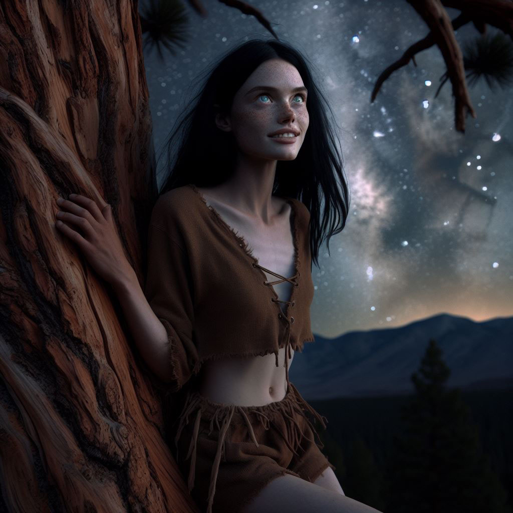
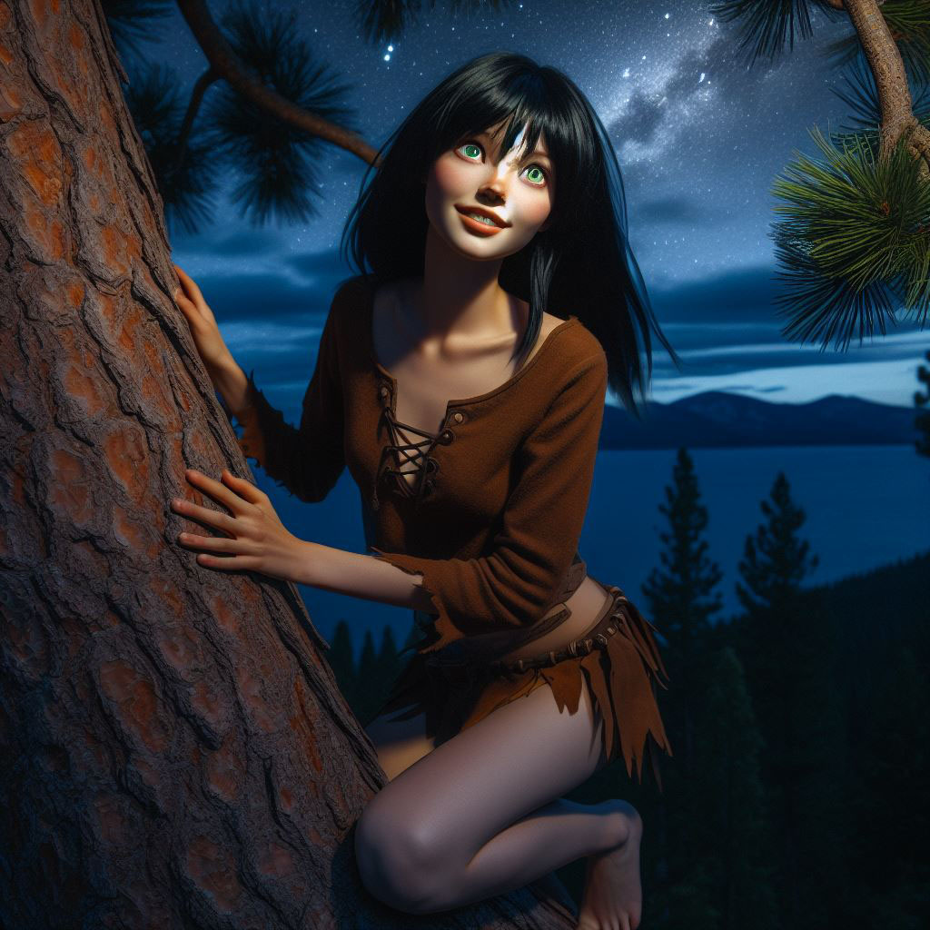
A typical prompt was a description of Zorya climbing a tree in the Idaho night, with the Milky Way overhead and her rapt gaze at the sky. A lot of details, separated by commas. An example, late in the evolution of the prompt:
long shot, night lighting, no moon, realistic style, dark sky showing Milky Way, slim young white woman with long uncombed black hair, pale skin, no freckles, climbing a rugged ponderosa pine tree, barefoot, very large green eyes, gazing upward at the sky, smiling, sharp pointed teeth, simple brown leather shirt, short-sleeved, simple brown mid-length leather shorts, no fringes on shirt or shorts, forest and tall mountains in background
AI illustration never gives you the same results twice. It would be hell trying to make a series of illustrations of a consistent character with it. Styles changed, realism changed, the background changed, her hair changed, and her leather “hunting” outfit changed. It was hard convincing the computer to keep the outfit simple. The AI leaned heavily toward ornaments and leather fringes, more suitable to a country singer.
One had two left arms. Another had a hand on backwards.
“Thin” generated cadaverous looks. I switched to “slender.”
Some versions were more “cartoony” than the rest. One was outright “chibi.” Most showed too much damn skin.

There were many others. Dall-E has a “variations” command I can use on an existing image, but the results looked more like a Star Trek transporter accident:

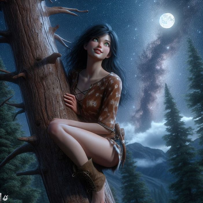
But trial and error worked. A generation took only a minute or so. I had to buy some “points” for Dall-E, but it was only fifteen bucks. The basic process took about an afternoon, far less time than the Photoshop pasteup design. Eventually, Bing Designer generated this:
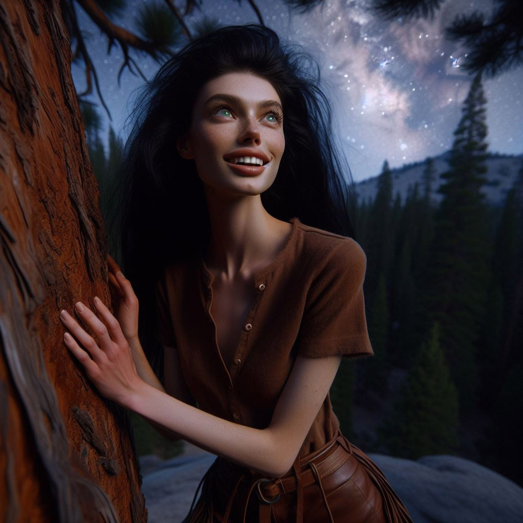
There were still some flaws. The head was a little large for the body for pure photorealism, the hand had odd proportions, some leather fringes were still hanging on, and the AI stubbornly refused to give her pointed teeth. But the look and expression were exactly what I wanted. I fixed her hair a bit, then pulled the image into Dall-E proper and used their scene extension function to create the vertical that I needed:
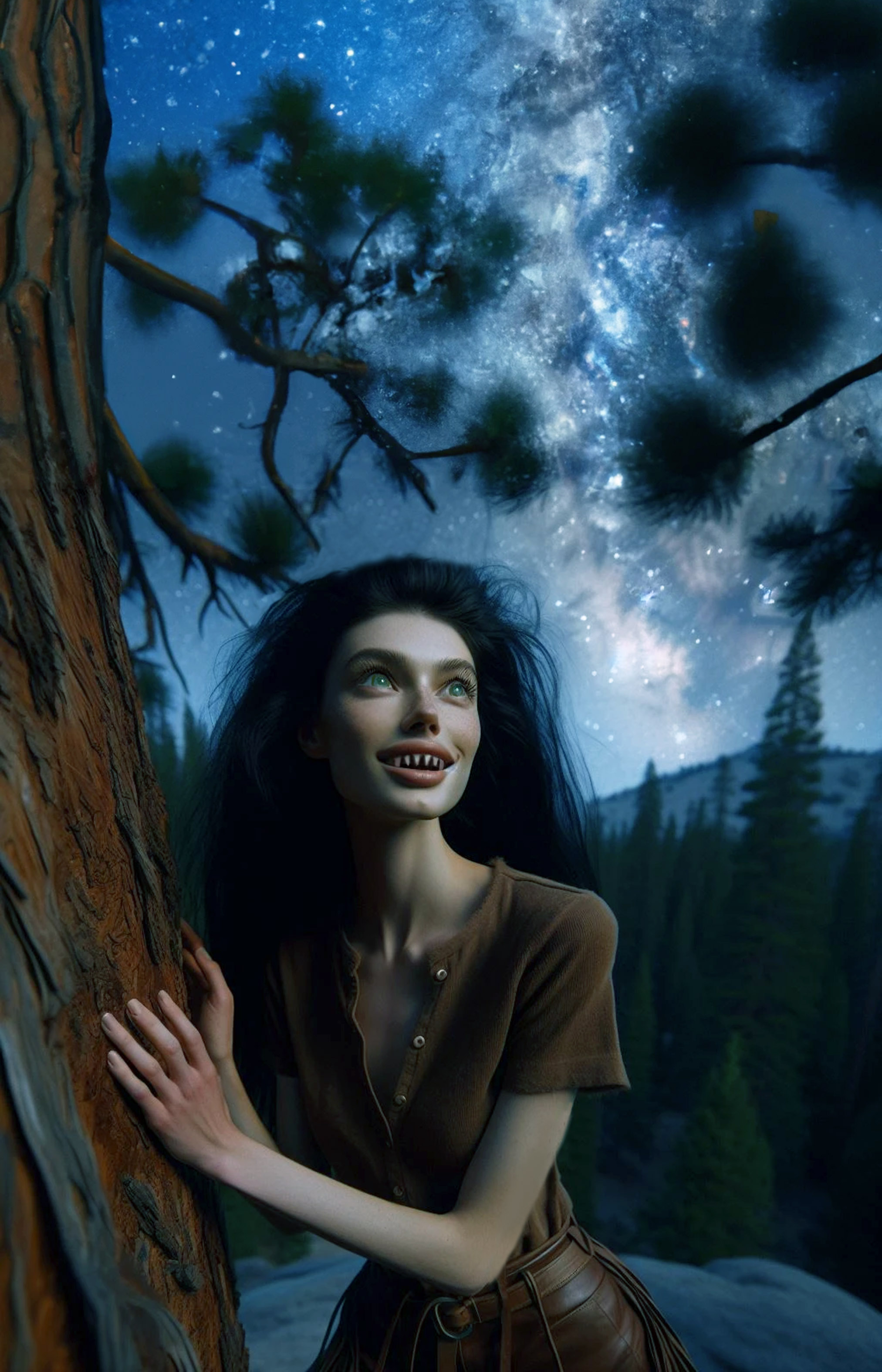
I trimmed the extension and then used Photoshop to “sharpen” her teeth. Early attempts looked more like shark teeth, and not the more needle-like look I was trying for. I settled on this:
Then I tweaked her left hand a bit so the fingers looked a bit more realistic. Cleaned off the leather “fringes” from the pants, and made the eyes a bit more luminous. I would have felt better with more buttons closed up on the shirt, but I wasn’t going to get nuts about it.

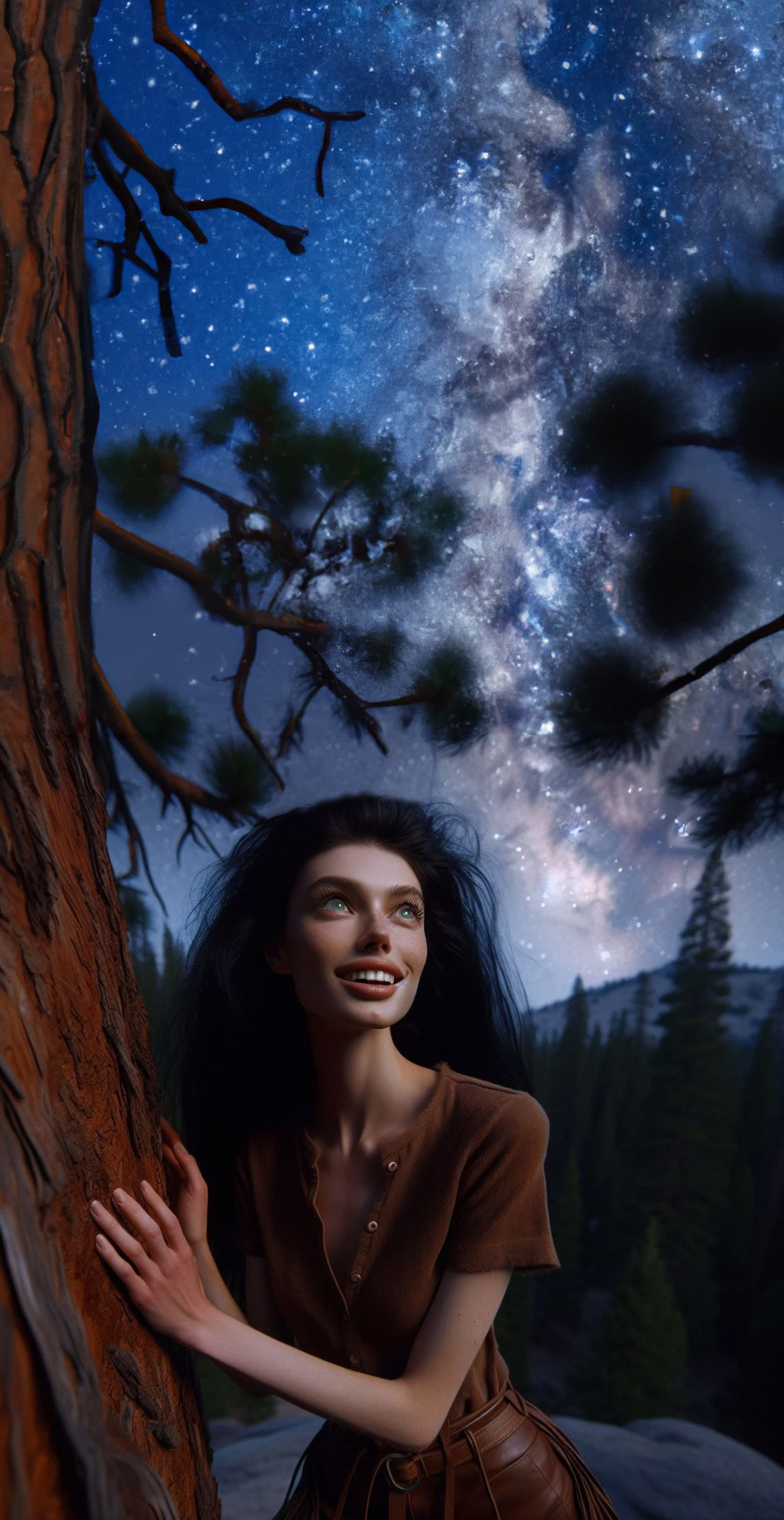
The final new cover:

Next step of course was the tedious updating of all my on-sale editions, along with the websites where Zorya is featured or mentioned. But the overall job was a success, and much easier than I thought it would be. Again, these images are one-offs. Someday, it might be possible to say “make another image using exactly this person only wearing different clothes and walking on a sidewalk.” Not yet.
Coming up soon: now how about Castle Falcon?

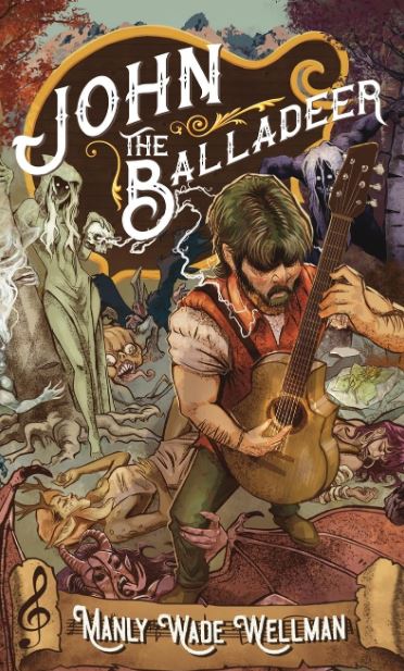
I posted a comment online today recommending Manly Wade Wellman’s “John the Balladeer” book to someone. Wellman has been one of a far-too-large number of authors I can read only in books from my shelf, since the publisher never released Kindle versions of the book.
I use my Kindle a lot, since I read everywhere and all the time, and it’s nice to have a copy on there as well (I have hundreds of books in both formats).
Imagine my surprise to look up the book in passing today to find out there’s been a Kindle edition out since October. Not to mention many other Wellman books that have come out in the couple of years since I last checked. Even the hard copy books have been mostly out of print (my own hardcover is an old Book Club Edition).
This is a bit annoying, since I have actually been following Wellman on Amazon for a long time. A little flag on these events might have been appreciated.
Never mind. Take my money!
Props to Valancourt Books, one of many small and dedicated publishers that is out there resurrecting beloved books long out of print, and resurrected this one for me.

I don’t have a good memory for names, even book authors, which is a terrible trait for a writer who hoped to get into the industry.
It was only a few years ago that I realized that the Father Brown mystery books (admittedly, I had only read one at that point) were written by the famous writer G. K. Chesterton. I only found this out after buying a Kindle edition of Chesterton’s complete works, and finally read the rest of the Father Brown stories and much more besides.
I was a lot older than I should have been when I discovered that Ray Bradbury (an author whose name is very familiar to me) wrote noir detective stories.
Today, I was looking at a post on Facebook from my writers’ group about a rabbit named Edward Tulane. I had never heard of this book before, which gives you some idea of my scholarship in this field. So I looked up the book, and then immediately looked up Kate DiCamillo. I found out that she had written Because of Winn Dixie, Flora and Ulysses, and The Tale of Despereaux, all of which I had heard of, along with The Magician’s Elephant, which I actually have tagged on Netflix to watch soon.
I imagine more professional writers know all this stuff, and have read almost every book in their field. I’ll never be that thorough–writing is my second job and probably always will be. But at least I can have the fun of discovering things even if I’m far from the first. I remember introducing someone to Terry Pratchett who had never read him before. I almost envied him the joy of treading that ground for the first time. And that was fun, too.
I grew up in places where the only comic books were in drugstores. The first comic book store in America wasn’t even founded until I was fourteen years old, and it was 2,000 miles away. I couldn’t afford to buy all the comics at the drugstore that I wanted to read, and the proprietor of the store took a dim view of my standing there and reading them.
“Put that back, son. This isn’t a library.”
Well, years later as an adult I had money for comic books, and even better, great comic stores near where I lived. They’d pull my favorites for me to pick up once a week, and didn’t care if I stood at the racks and read some without buying them. That’s progress.
But where I see real progress is that you can go into a public library today and they often have a set of shelves devoted to…yes, comic books!
Graphic novels, manga, you name it. And yes, you can check them out with your card! I would have given anything to have had this kind of thing years ago.
Yeah, kids, you don’t know how good you’ve got it nowadays. Now get off my lawn.

(Graphic novel collection at Kalamazoo Public Library)
I use GoDaddy to host all my book websites. It’s not cheap, but it works, and it’s generally worth it when things go wrong.
GoDaddy sent me a notice that they were going to migrate to new servers, with a new DNS number, and that I should not have to do anything to keep things working.
Well, they migrated, and my sites stopped working. I had no idea why, and a crawl through GoDaddy’s controls left me as mystified as they always do. Got hold of text support (eventually), and the usual wizards came on board.
Between two of them, they fixed everything while I sat with folded hands. How? I don’t know. Something to do with alerting my security settings about the new DNS. I think it might have been something like “franniting the wheelstone.”
In any case, whatever else there is about my hosting service, the tech support has been the very best kind, i.e. people who will cheerfully and patiently fix things for you even though you yourself are cosmically ignorant about the tech involved.

I’m running a Goodreads Giveaway for an autographed paperback of Zorya and a free bookmark. I’ll be giving away seven copies. Check it out when the Giveaway starts!
![]() (Click to go to Giveaway)
(Click to go to Giveaway)
